Candlestick Charts
Candlestick charts were devised by Japanese traders several centuries ago, reportedly to help in trading rice. Since their introduction in the West during the 1990s by Steve Nison, candlesticks have stormed all the markets and are now used by a majority of analysts. Candlesticks became popular because they impart more information visually than regular bars.
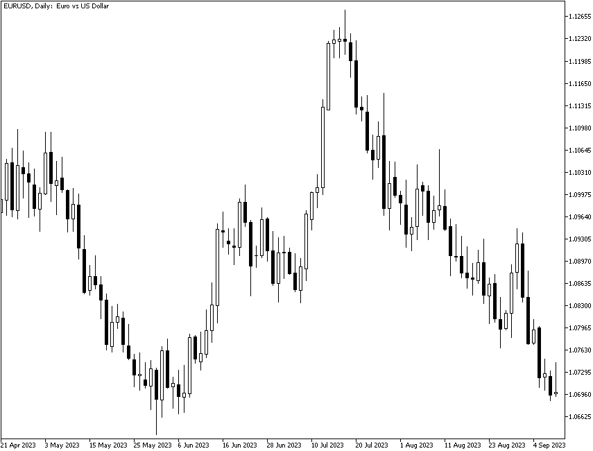
A candlestick bar emphasizes the open and the close rather than the high and the low, as in regular bars. The candlestick consists of a rectangle (named the “real body”) in which the top of the box is either the open or the close, and you know at a glance which one because if the close is at the top of the box, the box is white. White connotes that the day was a happy one for buyers since the close is above the open.
If the candle is black, it means the close was at the bottom of the box, and as in all bar analyses, the close below the open means negative sentiment occurred during the course of the timeframe the bar is covering.
When you see a series of white bars, you know that this means the close is consistently higher than the open and you may have higher highs as well, and so you get an immediate sense of comfort that this is a security that is okay to hold. Conversely, when you see a series of black bars, it means negative sentiment in ongoing and you should be short.
Note that you will also see the bars colored green and red or some other combination of colors.
The high and low are depicted by lines projecting from the top and bottom of the real body. These are named shadows, although you will also see other names, like wick (as in candlewick) and tail.
You can learn more about the anatomy of a candle in a lesson on Japanese candlestick structure.
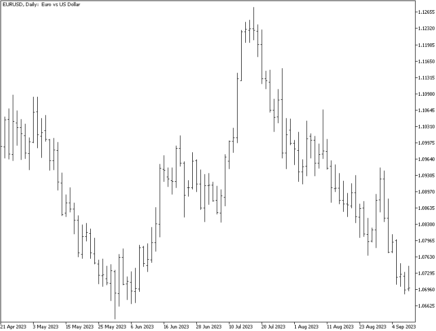
Japanese candlestick structure has one tremendous advantage over the conventional bar. A regular bar is just a vertical line, whereas the candlestick has a rectangular “real body,” making it literally bigger. When the close is higher than the open, the real body is white. When the close is lower than the open, the real body is black. A series of bodies all in one color has an immediate visual impact. Compare the two charts below. Which series gives a more vivid impression?


In addition to visual immediacy, candlesticks have another great advantage — they can be used on any timeframe, down to one minute. In fact, if you are a very short-term trader with a holding period of 15 minutes to 4 hours, you can use candlesticks in multiple timeframes, with the shorter timeframes revealing a loss of momentum, for example, as bars get shorter and perhaps even fade into dojis (open and close are the same). Be aware that at the end of trading sessions, especially the New York session, you will see a lot of small real bodies and dojis as traders pare positions.
Size Matters
As in all bars, the bigger the candle, the more trading action occurred during the period. A small real body means not much went on, while a very large candle whose open and close surpass the open and close of the preceding bar is named an “engulfing candle.” When the bar is white (close over open), it is a “bullish engulfing candle,” meaning it opened below the previous day’s open but then surpassed the close. If it is a black candle (close below open), it is a “bearish engulfing candle.”
You can proceed to our lesson on Candlestick Patterns if you want to learn more about them.
A specific candlestick pattern often seen in Forex is the doji, in which the open and close are almost the same and, therefore, the real body is just a horizontal line. A doji looks like the plus sign: +. The open and close at the same level already tells you that the market is indecisive, but to see one near the end of a trend consisting of big real-body bars is visually more compelling than on a conventional bar chart — the absence of action is immediately noticeable. The doji may or may not mean the move is ending — you need to see the next bar to detect that. But the doji is a warning.
Disadvantages of Candlesticks
Candlesticks emphasize the open and close, relegating the high and low to secondary status. And yet, the conventional definition of an uptrend is a series of higher highs and higher lows (with higher closes assumed), and the definition of a downtrend is a series of lower lows and lower highs (with lower closes assumed). You can torture data to get a series of higher highs and higher lows that has lower closes, but that would be an aberration, and such a series would not last very long. As a rule, an uptrend has higher highs. And so, candlestick charts fly in the face of one central definition of trendedness.
Candlesticks do not tell you which came first, the high or the low. In conventional bar charts, the horizontal tick line to the left of the vertical line is the open, and the one to the right is the close. Depending on what timeframe you are looking at, you may not care which came first, the high or the low, but bars give you some warning about what to expect next. When the open is near the low and the close is near the high, for example, you expect the next bar to be bullish. To be fair, the equivalent candlestick will indicate the same thing since it will be white, but often bar analysis needs to be more nuanced than candlesticks allow.
In addition, candlesticks are short-term indicators that summarize sentiment for only one to five periods. As noted above, a doji coming at the end of a long series of unidirectional bars is a warning, but it is not conclusive until the next period’s data is in. Candlestick analysis is always a work in progress.
Another issue is that there are dozens of candlestick patterns. You can easily learn the top five patterns, but trying to apply more than that becomes tedious.
It is possible to put too much stock in candlesticks. Like all indicators, they only indicate, they do not dictate. You may see a candlestick pattern that seems to point toward a specific trading decision — like the doji at the end of a long series of white or black candles mentioned above – but then the trend resumes. One pattern that routinely fails in Forex is “three white candles” and “three black candles,” which in standard candlestick analysis means that momentum has been reached and the next candlestick will be a continuation candlestick in the same direction. But in Forex, it is rare to get a fourth continuation candlestick. The fifth one, maybe, but not the fourth. You should have a grasp of the degree of trendedness and the stability of the trend before applying candlestick analysis. You cannot analyze modifications to a trend until you know that you have a trend and its dimensions.
Compatibility with Other Indicators
Candlesticks work perfectly well with all indicators, which is logical since indicators tend to use the closing price, like candlesticks. Everything works – MACD, RSI, stochastics, support and resistance, etc.